Tuesday, 26 April 2011

Monday, 18 April 2011

Up All Night Part 2


Piper Gates were once again asked to create the cd cover for Going Undeground's latest happening which takes place at Lock 42 on June 4th 2011. Continuing to base the design on Phil Smee's legendary Rubbles series it was decided to visualise the look of the Rubbles series had it been conceptualized by the design department responsible for the Top of the Pops compilation albums of the 1970s.

Friday, 1 April 2011

Garcia


Opening titles and novelisation from "Garcia" the non existent detective series from 1970 starring Larry Graham, Orson Wells and Richard Roundtree.

Tuesday, 1 March 2011

Bedazzled Poster


Deciding to revisit Penguin Books and the Marber grid a year after the initial explorations it was decided to investigate the illustrative qualities of some of the Penguin titles particulary the work of Charles Raymond. The result is a limited edition 500mm x 700mm poster numbered and signed by the artist of Peter Cook in his Drimble Wedge & The Vegetations mode.

Going Underground revisited


Piper Gates was very pleased to be asked to design the cover for the free cd to be given away at Going Underground's first allnighter on March 5th 2011 at Lock 42, Leicester. The concept for the cover was to make it a homage to Phil Smee's groundbreaking design work on the Rubbles compilations but with a typical Piper Gates twist re-imagine the Rubble design had it conceptualised by the design department of K-Tel Records in the 1970s.

Thursday, 27 January 2011

Prisoner Postcards

The complete set of eight postcards

Number One and Number Two

Number three and Number Four

Number Five and Number Six

Number Seven and Number (Forty) Eight

Postcard Wallet

As a sequel to The Prisoner poster (think Godfather 2 not Jaws 2) a limited edition set of eight postcards has been created. Each postcard represents an iconic moment from the genius that is The Prisoner. The set of eight postcards comes with a wallet to keep all these subversive elements together in their own little village and is signed and numbered by the artist.

Tuesday, 18 January 2011

How to make the mundane interesting: part two


A Developement Cycle & Creation essay was re-imagined as a twenty page booklet with the cover influenced by Jan Tschichold's posters for Phoebus Palast and the inside being influenced by the layout of Look-in and Jackie magazines from the 1970s.

Tuesday, 14 December 2010

The Prisoner Poster


Based on the popular piper gates postcard which in turn was inspired by the classic look of Penguin Books this 500mm x 700mm print comes as a limited edition print signed by the artist.

Monday, 6 December 2010

Syd Barrett Colouring Book


The second in the "Piper Gates" series of colouring books. As with the Joy Division colouring book its 8 pages of colouring in fun plus a free 7 inch sleeve of Arnold Layne which can also be coloured in.

Tuesday, 30 November 2010

Doctor Who: The Curse of Peladon Poster


Based on the popular piper gates postcard which in turn was inspired by the classic look of Penguin Books this 500mm x 700mm print comes as a limited edition print signed by the artist.

Stoned Poster


In an alternate universe...

Wednesday, 10 November 2010

Joy Division Colouring Book & Transmission sleeve to colour in


Limited edition Joy Division Colouring Book. The first in the "Piper Gates" series of colouring books it comes as a four page cover with eight whole pages of colouring fun. Also includes a free Transmission sleeve to colour in.

Friday, 22 October 2010

Hive Films Postcards


Postcard set designed for Hive Films. The client wanted a display of bold typography to grab immendiate attention and then built on this with the use of film quotes to align themselves to their cultural forefathers.

Thursday, 21 October 2010

How to make the mundane interesting: Part one


Having to write a business proposal for course work it was decided to liven up its appearance by visualising it as a 4pp leaflet. Inspired by Jan Tshichold the front and back cover were created in a homage to the great man.

Wednesday, 11 August 2010

Tinker Tailor Soldier Spy Poster


Specially commisssioned poster. The client wanted the poster to be retro yet contempory so the influence of timeless Swiss Graphic Design was used for inspiration.

Friday, 11 June 2010

Braunstone Cricket Club A5 Flyer/ Postcard


Digitally printed recruitment postcard and A5 flyer for Braunstone Cricket Club. To draw attention to potential cricketers a photo of the childhood favourite 'Test Match' was used to evoke a reminder of the wonders of yesteryear and the excitement of cricket for those who might have forgot.

Thursday, 6 May 2010

Doctor Who & The Ink Spots 4 page leaflet


This is another piece of course work, a four page A5 digitally printed leaflet. To create more interest in the subject matter for both author and reader alike it was decided to include a favourite subject of the author Doctor Who. The design was planned as a follow up to the Penguin Book homage done previously. The look is based on the classic Penguin design of the 60's and 70's and uses the same grid. The use of cyan, magenta and yellow ink spots together with the black type represents the four colour process used in both digital and litho printing.

Monday, 15 March 2010

Saturday, 20 February 2010

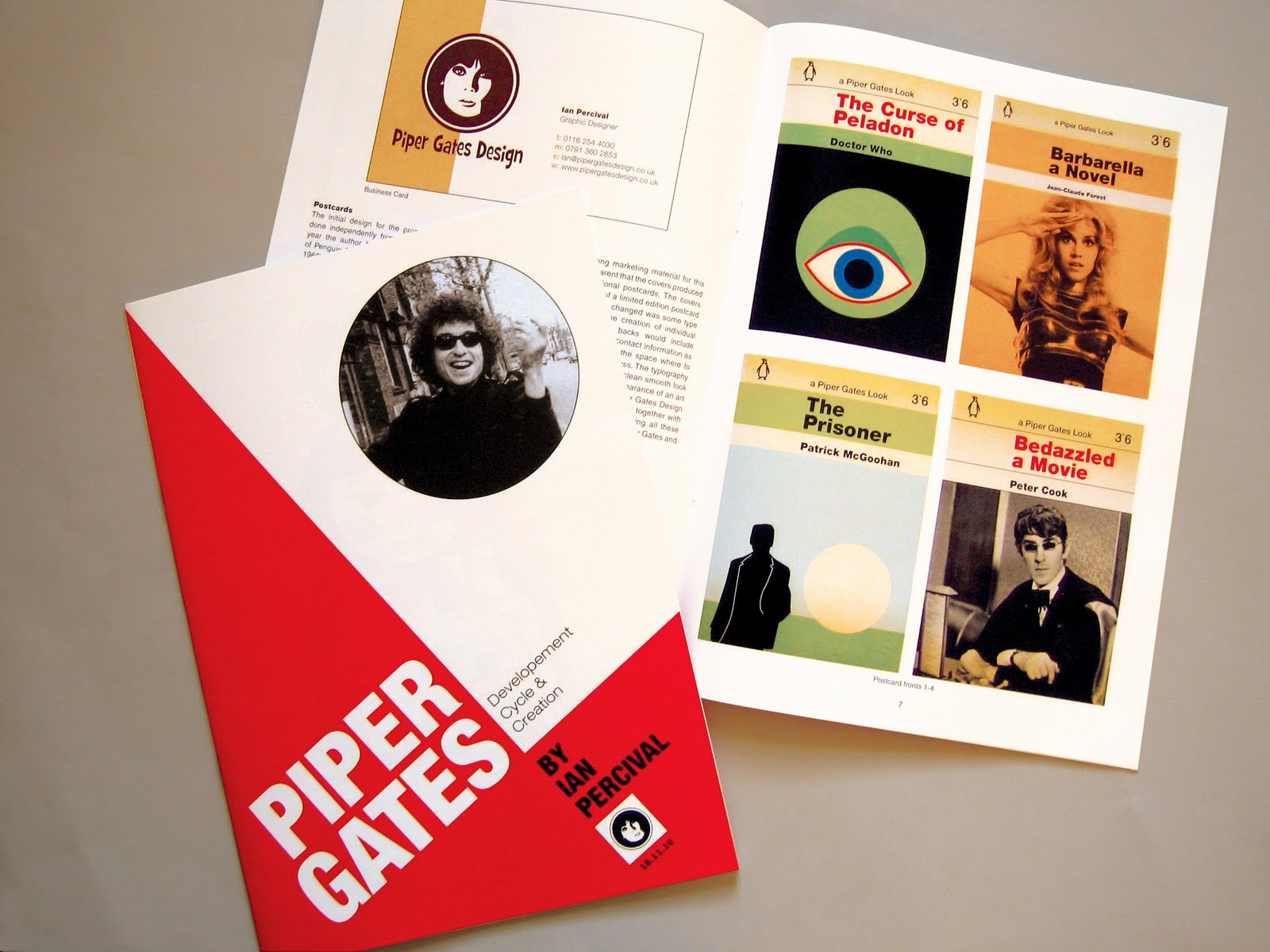
Penguin Books Tribute & Postcards


Recently I have become rather in awe of the design of Penguin Books. I like the simplicity and the adaptability of how one layout can be used to create a variety of different designs but still keeps a uniformity which makes the brand distinctive. To understand this more I decided to create the above covers using the same layout and gave them a vintage look to make them look authentic. I decided to create something of interest to me and found inspiration from a favourite story of Doctor Who and the films Bedazzled, Carry on Girls, Dawn of the Dead, Barbarella plus the Patrick McGoohan classic The Prisoner.